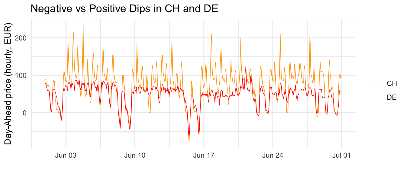
Price extremes, both negative and positive, are a key feature of energy markets. The chart below provides a preliminary visual analysis of Day-Ahead prices for Germany and Switzerland in June 2024. Historically, Swiss prices tend to be lower than German prices, and this trend is evident here. Interestingly, Swiss prices appear to plateau at a certain level and avoid the extreme spikes seen in Germany. This stabilization is likely attributable to Switzerland’s significant hydropower reserves. Another noticeable pattern is that Swiss prices (red curve) tend to follow German prices (orange curve) closely when they drop below a certain threshold, especially during negative price events.
Show Code
base_url<-"https://api.energy-charts.info/price"bidding_zone<-"CH"start_date<-as.Date("2024-06-01")end_date<-as.Date("2024-06-30")# Fetch the price datach_day_ahead_prices<-fetch_prices(base_url, "CH", start_date, end_date)%>%dplyr::rename(price_ch =price)de_day_ahead_prices<-fetch_prices(base_url, "DE-LU", start_date, end_date)%>%dplyr::rename(price_de =price)# join them and plot the chartde_day_ahead_prices%>%dplyr::left_join(ch_day_ahead_prices, by =join_by(timestamp))%>%ggplot(aes(timestamp))+geom_line(aes(y =price_de, color ="DE"), linewidth =0.3)+geom_line(aes(y =price_ch, color ="CH"), linewidth =0.3)+scale_color_manual( values =c("DE"="orange","CH"="#FF0000"), name ="")+labs(x ="", y ="Day-Ahead price (hourly, EUR)", title ="Negative vs Positive Dips in CH and DE")+theme_minimal()
2.1.2 Increase in Negative Prices
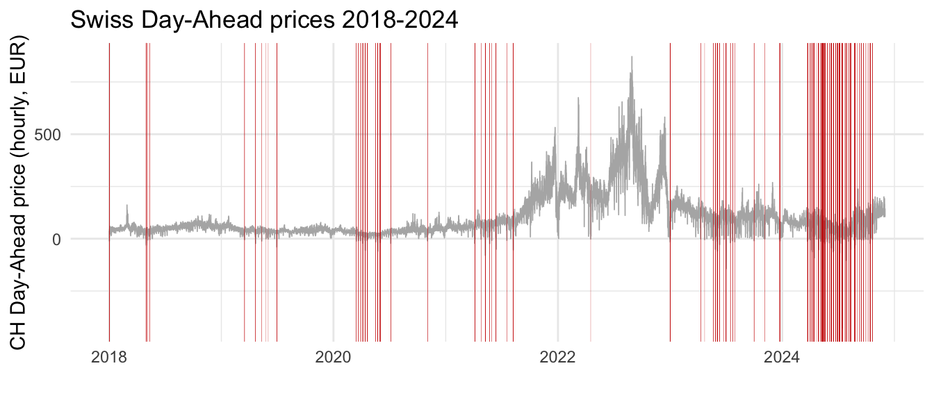
To explore the phenomenon of negative prices further, the following graph illustrates Switzerland’s Day-Ahead auction prices on an hourly basis since 2018. Red bars highlight hours with negative prices, and it is evident that their frequency has surged significantly since 2023.
Show Code
# Define base parametersbase_url<-"https://api.energy-charts.info/price"bidding_zone<-"CH"start_date<-as.Date("2018-01-01")end_date<-as.Date("2024-11-30")# Fetch the price dataday_ahead_prices<-fetch_prices(base_url, bidding_zone, start_date, end_date)# plot the chartday_ahead_prices%>%ggplot(aes(timestamp, price))+geom_line(linewidth =0.3, color ="gray70")+geom_vline(data =.%>%filter(price<0), aes(xintercept =timestamp), color ="red3", linewidth =0.05)+labs(x ="", y ="CH Day-Ahead price (hourly, EUR)", title ="Swiss Day-Ahead prices 2018-2024")+theme_minimal()
Take Away
If stable prices are considered the ideal scenario, the increase in extreme negative prices represents a growing challenge for Swiss energy utility companies. Positive price peaks are a known issue, but the Swiss market has been relatively protected. Hence, new challenges are comming for Swiss EVU.
2.2 Increase in Volatility
Understanding this trend requires isolating it from major external events, such as the Ukraine war. For a clearer perspective, we compare the summer months of 2024 with a pre-war baseline year, 2018.
2.2.1 Daily Extremes
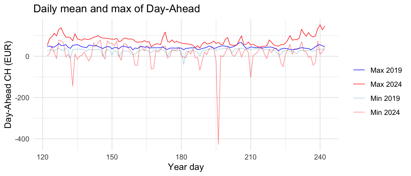
The next chart presents the daily extreme values—minimum and maximum—for the summer months of 2018 and 2024. A clear increase in extreme values is visible for 2024, with more pronounced fluctuations in both directions.
Show Code
# calculates excess kurtosis, the 4th moment, which is a metric for extremesexcess_kurtosis<-function(x){n<-length(x)mean_x<-mean(x)sd_x<-sd(x)kurtosis<-sum((x-mean_x)^4)/(n*sd_x^4)excess_kurtosis<-kurtosis-3return(excess_kurtosis)}# Define base parametersbase_url<-"https://api.energy-charts.info/price"# Fetch the price dataold_day_ahead_prices<-fetch_prices(base_url, "CH", as.Date("2019-05-01"), as.Date("2019-08-31"))new_day_ahead_prices<-fetch_prices(base_url, "CH", as.Date("2024-05-01"), as.Date("2024-08-31"))# calc some statsstats_day_ahead_prices<-rbind(old_day_ahead_prices, new_day_ahead_prices)%>%dplyr::mutate(date =lubridate::date(timestamp))%>%dplyr::group_by(date)%>%dplyr::summarise( n =n(), min_price =min(price), max_price =max(price), mean_price =mean(price), sd_price =sd(price), kurtosis_price =excess_kurtosis(price), .groups ="drop")%>%dplyr::filter(n==24)%>%dplyr::mutate(yday =lubridate::yday(date), year =lubridate::year(date))%>%dplyr::select(yday, year, min_price, max_price, mean_price, sd_price, kurtosis_price)%>%tidyr::pivot_wider(names_from ="year", values_from =c(min_price, max_price, mean_price, sd_price, kurtosis_price))%>%tidyr::drop_na()stats_day_ahead_prices%>%ggplot(aes(x =yday))+geom_line(aes(y =min_price_2019, color ="Min 2019"), linewidth =0.3)+geom_line(aes(y =min_price_2024, color ="Min 2024"), linewidth =0.3)+geom_line(aes(y =max_price_2019, color ="Max 2019"), linewidth =0.3)+geom_line(aes(y =max_price_2024, color ="Max 2024"), linewidth =0.3)+scale_color_manual( values =c("Min 2019"="lightblue","Min 2024"="#FF000080","Max 2019"="blue","Max 2024"="red"), name ="")+labs( title ="Daily mean and max of Day-Ahead", x ="Year day", y ="Day-Ahead CH (EUR)")+theme_minimal()
2.2.2 Daily Variance
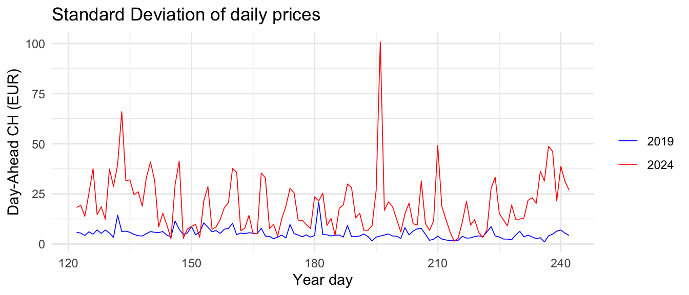
The standard deviation, a measure of intraday volatility, confirms this increased instability. Higher values indicate less stable prices within a given day
Show Code
stats_day_ahead_prices%>%ggplot(aes(x =yday))+geom_line(aes(y =sd_price_2019, color ="2019"), linewidth =0.3)+geom_line(aes(y =sd_price_2024, color ="2024"), linewidth =0.3)+scale_color_manual( values =c("2019"="blue","2024"="red"), name ="")+labs( title ="Standard Deviation of daily prices", x ="Year day", y ="Day-Ahead CH (EUR)")+theme_minimal()+theme(legend.position ="right")
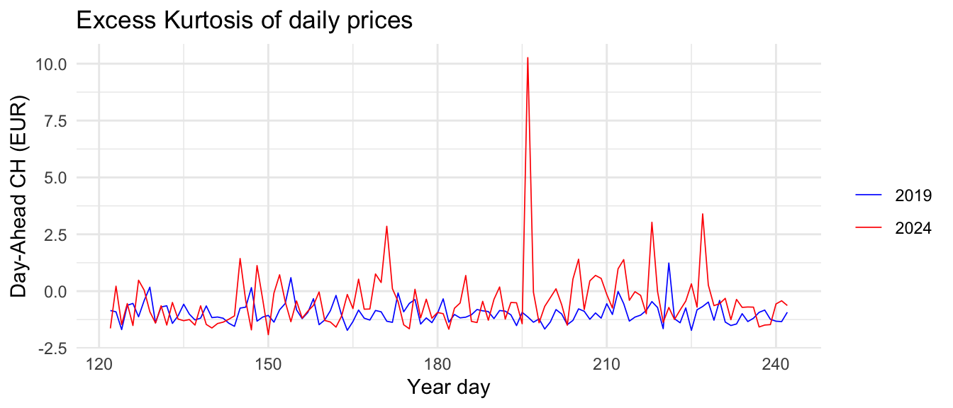
2.2.3 Daily Outliers (Kurtosis)
Additionally, the excess kurtosis, a measure of the frequency and intensity of price extremes, shows elevated values for 2024, reflecting a higher occurrence of extreme events within the day.
Show Code
stats_day_ahead_prices%>%ggplot(aes(x =yday))+geom_line(aes(y =kurtosis_price_2019, color ="2019"), linewidth =0.3)+geom_line(aes(y =kurtosis_price_2024, color ="2024"), linewidth =0.3)+scale_color_manual( values =c("2019"="blue","2024"="red"), name ="")+labs( title ="Excess Kurtosis of daily prices", x ="Year day", y ="Day-Ahead CH (EUR)")+theme_minimal()+theme(legend.position ="right")
Take Away
There is not doubt. Day-Ahead auction prices in 2024 are markedly more volatile compared to previous years. This is true for both negative and positive price peaks.
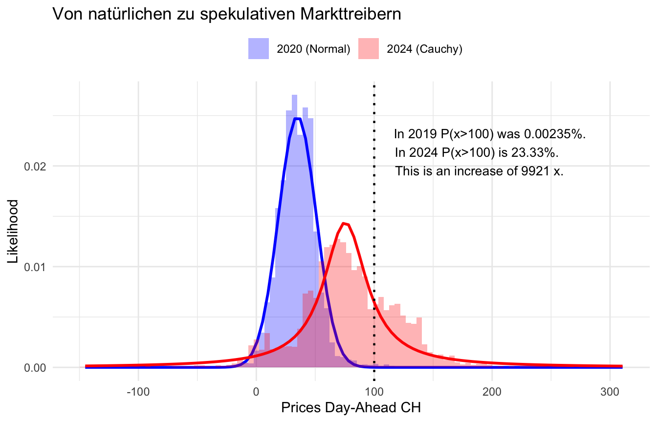
2.3 Here come the Black Swans
Show Code
fit_cauchy<-function(x){fit<-fitdistr(x, densfun ="cauchy")cauchy_density<-function(x)dcauchy(x, location =fit$estimate["location"], scale =fit$estimate["scale"])return(list(dens =cauchy_density, fit =fit))}fit_normal<-function(x){fit<-fitdistr(x, densfun ="normal")normal_density<-function(val)dnorm(val, mean =fit$estimate["mean"], sd =fit$estimate["sd"]*1)return(list(dens =normal_density, fit =fit))}# calculate the exceedence probabilityexceedence_p<-function(dist_2019, dist_2024, X){p_2019<-1-pnorm(X, mean =dist_2019$fit$estimate["mean"], sd =dist_2019$fit$estimate["sd"])p_2024<-1-pcauchy(X, location =dist_2024$fit$estimate["location"], scale =dist_2024$fit$estimate["scale"])list( txt =paste0("In 2019 P(x>", X ,") was ", round(100*p_2019, 5), "%. ","\n In 2024 P(x>", X ,") is ", round(100*p_2024, 2), "%. ","\n This is an increase of ", round(p_2024/p_2019)," x."), increase =round(p_2024/p_2019))}data<-get_stats_data(c(2020, 2024))%>%dplyr::select(tmsp, year, price)%>%group_by(year)%>%dplyr::mutate( tail =abs(price-mean(price)), type =ifelse(price<mean(price), "negative", "positive"))%>%tidyr::drop_na()%>%tidyr::pivot_wider(names_from ="year", values_from =c(price, tail))%>%tidyr::drop_na()X<-100dist_2020<-fit_normal(data$price_2020)dist_2024<-fit_cauchy(data$price_2024)ex_p<-exceedence_p(dist_2020, dist_2024, X)
Excess kurtosis serves as a useful proxy for identifying extreme prices, but it does not fully capture the phenomenon of so-called “Black Swans.” Black Swans are rare, extreme events that significantly alter the overall landscape. In such cases, traditional metrics like mean and standard deviation lose their relevance, as outliers overwhelmingly shape the dynamics.
To explore this phenomenon, we model the hourly Day-Ahead prices for 2020 and 2024, estimating their theoretical probability distributions. For 2020, the normal distribution fits the observed prices well. However, in 2024, the picture changes dramatically. Not only do the average prices and the variability rise, but more importantly, the normal distribution no longer provides a good fit for the observed prices. Instead, the data aligns best with the Cauchy distribution — a distribution known for its exceptionally heavy tails.
This shift has profound implications. For instance, the likelihood of observing a price greater than 100 EUR/MWh is 9921 times higher in 2024 compared to 2020. This marks the arrival of “Black Swans” in the energy market—unpredictable, high-impact events that have an outsized effect on finances of EVUs.
Show Code
ggplot(data)+geom_histogram(aes(x =price_2020, y =..density.., fill ="2020 (Normal)"), color ="transparent", bins =100, alpha =0.3)+stat_function( fun =dist_2020$dens, color ="blue", linetype ="solid", linewidth =1)+geom_histogram(aes(x =price_2024, y =..density.., fill ="2024 (Cauchy)"), color ="transparent", bins =100, alpha =0.3)+stat_function( fun =dist_2024$dens, color ="red", linetype ="solid", linewidth =1)+geom_vline(xintercept =X, color ="black", linetype ="dotted", linewidth =0.8)+annotate("text", x =X, y =0.02, label =ex_p$txt, hjust =-0.1, vjust =+0.2, size =3.5, color ="black")+ggplot2::scale_fill_manual( values =c("2020 (Normal)"="blue","2024 (Cauchy)"="red"), name ="")+labs( title ="Von natürlichen zu spekulativen Markttreibern", x ="Prices Day-Ahead CH", y ="Likelihood")+theme_minimal()+theme(legend.position ="top")# Position the legend
Take Away
Black Swans are rare, extreme events that can drastically affect the financial outcomes of EVU. In 2024, the probability distribution underlying Day-Ahead prices shifted, increasing the likelihood of such impactful events.